
Colors around you in your daily activities, play an important role in your life. We may tend to ignore our choices for colors, but if given importance it can improve our moods, energy levels, physical health, productivity and happiness. Let's first learn the basic color theory in common man terms, and how we can use them effectively.
Color theory is a guide to mix colors logically and create visual effects with various color combinations as required. The basics of color theory - the color wheel and color harmony - context of how colors are used. These theories can be used to choose color combinations while painting our house, artwork, fabrics and in any of your design.
1. The Color wheel
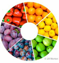
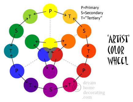
A color wheel chart helps us to relate colors with each other and find a color combination logically. There are two color wheels possible - A color wheel formed with 3 Primary colors - Red, Yellow, Blue (RYB) and the other wheel is formed with 4 Primary Colors - RYBG (adding green). The 3-primary color wheel is used for color mixing to bring the particular shade, especially in paints and the 4-primary color wheel is used to relate colors to what we see and how we feel. The Secondary colors are derived from a combination of two primary colors. Tertiary colors are derived from mixing one secondary color and one primary color. Neutral (Achromatic) colors are Grey, Black and Brown - which are not included in the color wheel. Neutral colors can be used to tone down the brightness of the original color wheel pigments. The 4-color wheel can be used to select warmer or cooler shades of the same color. It's outer ring scale shown below signifies red as warmer, yellow as warm, green as cool and blue as cooler. We would suggest to use 4-color wheel for better choices in your art, craftwork, fabrics, or interior design, as it has some feel factor in it.
Color theory is a guide to mix colors logically and create visual effects with various color combinations as required. The basics of color theory - the color wheel and color harmony - context of how colors are used. These theories can be used to choose color combinations while painting our house, artwork, fabrics and in any of your design.
1. The Color wheel
A color wheel chart helps us to relate colors with each other and find a color combination logically. There are two color wheels possible - A color wheel formed with 3 Primary colors - Red, Yellow, Blue (RYB) and the other wheel is formed with 4 Primary Colors - RYBG (adding green). The 3-primary color wheel is used for color mixing to bring the particular shade, especially in paints and the 4-primary color wheel is used to relate colors to what we see and how we feel. The Secondary colors are derived from a combination of two primary colors. Tertiary colors are derived from mixing one secondary color and one primary color. Neutral (Achromatic) colors are Grey, Black and Brown - which are not included in the color wheel. Neutral colors can be used to tone down the brightness of the original color wheel pigments. The 4-color wheel can be used to select warmer or cooler shades of the same color. It's outer ring scale shown below signifies red as warmer, yellow as warm, green as cool and blue as cooler. We would suggest to use 4-color wheel for better choices in your art, craftwork, fabrics, or interior design, as it has some feel factor in it.
 3-Primary Color Wheel  |  4-Primary Color Wheel 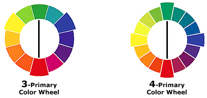 Complementary Colors |
Other color terminologies if you want to understand further:
Hue - Hue is the intensity or wavelength of the color - highly noticeable colors in the color wheel.
Tint - A tint is a color mixed with white - All Pastel colors used in our wall paints and ice creams :P.
Shade - A shade is a color mixed with black - Darker versions of a color.
Tone - A tone is a color mixed with grey - tones down your original color's intensity.
2. Color Harmony
Color Harmony is nothing but arranging your colors with a balance, that is pleasing to the eye, captures the viewer and creates a balance. This is an interesting part of color theory which we can use to decide our color combinations by certain pre-defined logic.
Analogous Colors
Analogous colors are any three adjacent colors in a 3-color wheel. Nature is the best teacher for color theory and we have umpteen number of examples around us. Below is an example for anlogous shades of blue.
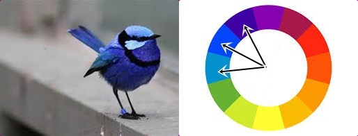
Analogous Blue Colors in a Bird
Complementary Colors:
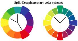
Complementary colors are any two diametrically opposite colors like red-green, purple-yellow, etc. giving maximum contrast. Choosing a pair of complementary colors from the two wheels is shown in the second image above. For Split-Complementary colors, combine a color with two colors to the right and left of the diametrically opposite color.
Complementary colors are any two diametrically opposite colors like red-green, purple-yellow, etc. giving maximum contrast. Choosing a pair of complementary colors from the two wheels is shown in the second image above. For Split-Complementary colors, combine a color with two colors to the right and left of the diametrically opposite color.
Monochromatic Colors:
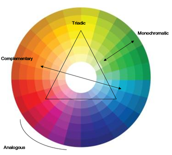
Monochromatic is the simplest of all - shades of the same color. Choose a color hue from the color wheel, add a shade (blackish shade), tint (whitish/pastel shade) to create a monochromatic series.
Triadic Color Scheme:
A triadic color scheme combines three equidistant colors on the color wheel chart.
Color Theory
For free downloadable Color Wheel Charts for personal use:
http://www.dreamhomedecorating.com/printable-color-wheel.html
Now that we have covered the basics of color theory, we can move on to decorating our living space with the gained knowledge. Please read our next post on Choosing Paints and Interior Colors - Coloring our World #2.
http://www.dreamhomedecorating.com/printable-color-wheel.html
Now that we have covered the basics of color theory, we can move on to decorating our living space with the gained knowledge. Please read our next post on Choosing Paints and Interior Colors - Coloring our World #2.
 RSS Feed
