This post is in continuation to the basics of color theory post. We would be using the basic color schemes to best decorate our living space. Every color has a significant stimulation of feelings and emotions to humans, and this is called as Color Psychology. Choose your interiors and paints, keping in mind the color combinations that can be used from the color wheel and the color psychology.
 |  Color Psychology Wheel |
Some points to remember when choosing colors for your interiors:
1. Choose your colors wisely and use moderately. We know that some colors add peace and harmony to the space, but when used in large amounts can cause the oppsite emotions.
2. Limit the number of colors in a room, maximum to 3-4. Too many colors can make the room look cluttered or clumsy.
3. If you are skeptical in repainting the room to any new color, change your curtains, fabrics, sofa and accessories color combinations for a trial.
4. Lighter shades make the room look larger and airy, Darker shades make it look cozy and intimate.
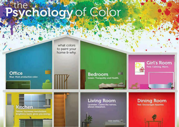
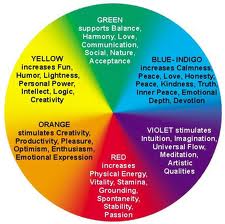
5. Red when used in moderate gives the best first impression, but more red gives more adrenaline and increases heart rate.
6. Yellow in moderate gives joy and happiness, but more yellow leads to losing temper at times.
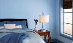
7. Blue is known for calming down and relaxing, use it best with lighter shades in combination with warmer blue like turquoise furnishing or fabrics. Avoid darker blue tones, which can cause gloominess.
8. Green is the most pleasant color to the eye, combining the qualities of blue and yellow.Green cools things down.
9. Purple in its darker shades shows luxury and lighter shades like lavender is same as blue effect, without any risk.
10. Orange evokes excitement and helps increase energy levels.
11. Light colored ceiling makes the room look bigger and dark ceiling makes the room cozy and intimate.
12. Black and other neutral colors are used to complement the color wheel colors and liven up the space.
Let's see some examples of color shemes used in adding colors to our living space.
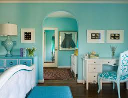
Monochromatic Interiors:
1. Choose your colors wisely and use moderately. We know that some colors add peace and harmony to the space, but when used in large amounts can cause the oppsite emotions.
2. Limit the number of colors in a room, maximum to 3-4. Too many colors can make the room look cluttered or clumsy.
3. If you are skeptical in repainting the room to any new color, change your curtains, fabrics, sofa and accessories color combinations for a trial.
4. Lighter shades make the room look larger and airy, Darker shades make it look cozy and intimate.
5. Red when used in moderate gives the best first impression, but more red gives more adrenaline and increases heart rate.
6. Yellow in moderate gives joy and happiness, but more yellow leads to losing temper at times.
7. Blue is known for calming down and relaxing, use it best with lighter shades in combination with warmer blue like turquoise furnishing or fabrics. Avoid darker blue tones, which can cause gloominess.
8. Green is the most pleasant color to the eye, combining the qualities of blue and yellow.Green cools things down.
9. Purple in its darker shades shows luxury and lighter shades like lavender is same as blue effect, without any risk.
10. Orange evokes excitement and helps increase energy levels.
11. Light colored ceiling makes the room look bigger and dark ceiling makes the room cozy and intimate.
12. Black and other neutral colors are used to complement the color wheel colors and liven up the space.
Let's see some examples of color shemes used in adding colors to our living space.
Monochromatic Interiors:
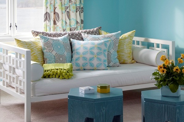
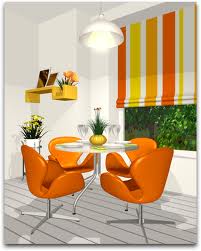
Analogous Colored Interiors:
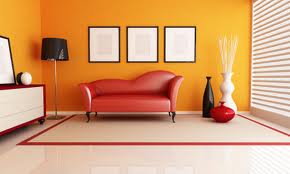

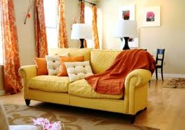
Complementary Colored Interiors:

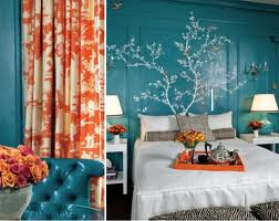
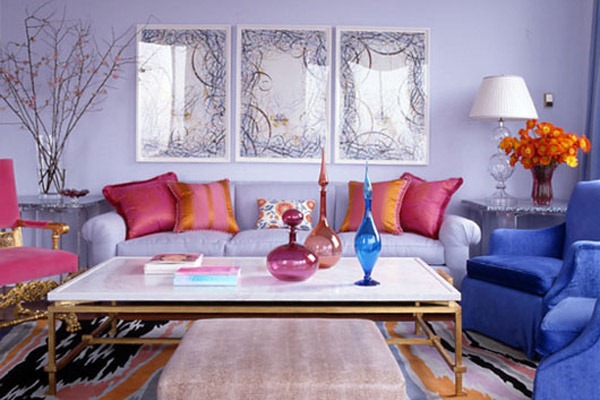
Split Complementary Colored Interiors:

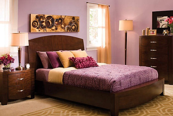

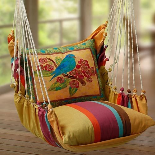
Our Favorite Picks for you:
Share your favorite color choices and combinations for your dream home in the comments below.
Share your favorite color choices and combinations for your dream home in the comments below.
Think before you choose your colors next time. Happy Painting and Re-creating!!
 RSS Feed
